# Ecommerce Components
You can build fully featured stores in Bootstrap Studio that can list products, let users maintain a shopping cart, enter payment details and checkout. Payments are deposited directly to your PayPal and/or Stripe accounts. This is done with the help of the Ecommerce components.
# Components
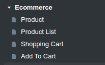
You can see the available components in the Ecommerce group, available in the Component panel:
These components use the Reflow toolkit behind the scenes (a sister project by Bootstrap Studio's developers), and display mock (fake) data by default. You will need to connect your Reflow account, to see live data from your store. After you do so you will see all the available options that are presented below.
Important
Some components are only available in Reflow v2. They are marked with a v2 badge. See how to change the Reflow version here.
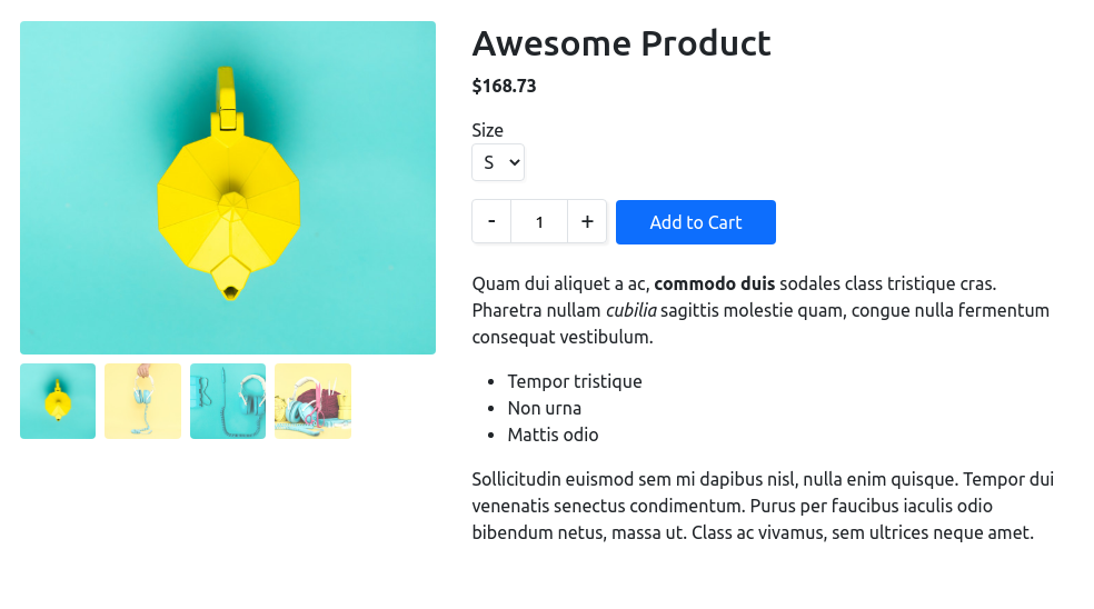
# Product
The Product component displays a product page with a name, media gallery, description and an Add to Cart button.
Note
If you need to display multiple products, use the Product List component, instead of placing individual product components on your page.
# Available Options
You can configure the product and change the way it's rendered from the Options Panel. There are a number of customization options:
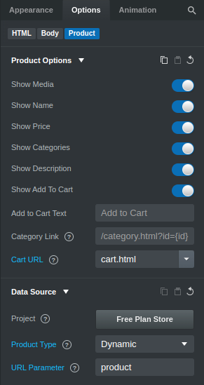
# Product Options
- Show XXX - toggle the product gallery, name, price, etc. You can show as much or as little information about the product as you need.
- Cart URL - a URL to the page where your Shopping Cart is located. When Add to Cart is clicked, a Toast notification is shown to let users know that the product was successfully added to their cart. If you have set the Cart URL option, this notification includes a See Cart button that opens the Shopping Cart page.
# Data Source
- Store - click the button to choose/change the Reflow Store. This is a design wide setting, so it will be applied to all ecommerce components in your project.
- Product Type - choose what type of product the component displays:
- Fixed - shows a specific product you choose by clicking Choose Product.
- Dynamic - dynamically gets the product ID from the page URL and shows the product associated with it. You have to provide the name of the URL parameter that contains the ID, e.g. in
https://example.com/product.html?product=111111the parameter isproductand the ID is111111.
- Product (available only if the product type is Fixed) - Click this button to choose which product from your store the component should display.
 (available only if the product type is Fixed) - Click this button to fetch the newest data after you've made changes to the product on Reflow's website.
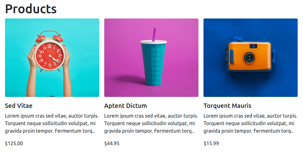
# Product List
The Product List component renders a collection of products in a list with optional pagination. You can filter the list to show only products from a specific category, change the ordering and select different layouts.
# Available Options
You can configure the Product List through the Options Panel. A number of customization options are available:
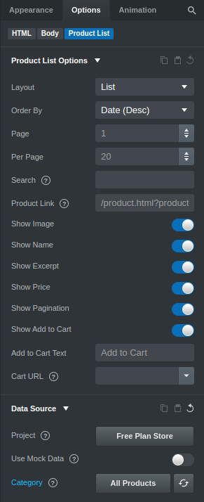
# Product List Options
- Layout - choose the layout of the product list. Currently products can be displayed as either cards or list (default).
- Order By - choose how the products are sorted. You can order them by name, date or price in both ascending and descending order.
- Page - choose which page of results to show (defaults to 1).
- Per page - choose how many products to show per page (defaults to 20).
- Product Link - if this option is provided, each product in the list will be wrapped in a link that points to this URL. The URL supports
{id}placeholders, which are replaced with the product ID (e.g./product.html?product={id}). Reflow v2 also supports{handle}placeholders which are replaced with the product handle (e.g./product.html?product={handle}). Set this URL to a page where aProductcomponent resides, and set theProductto Dynamic so it takes its ID from the URL. This way you can display products dynamically (see how to build a store with this technique). - Show XXX - toggle the product image, name, price, etc. You can show as much or as little information about each product in the list as you need.
# Data Source
- Store - click the button to choose/change the Reflow Store. This is a design wide setting, so it will be applied to all ecommerce components in your project.
- Use Mock Data - when this setting is switched on, Bootstrap Studio will generate mock data for the component. This setting is only applied in the app (you won't see the mock data in the Browser Preview or when exporting).
- Category - with this option you can limit the list to only show products from a specific category of your store.
- - Click this button to fetch the newest data after you've made changes to a product in the list on Reflow's website.
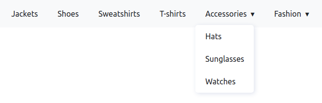
# Category List
The Category List component renders all categories and subcategories from your store. It can display them either as an unstyled list, or as a multi-level dropdown bar. You can use it to build navigation menus, sidebars and other UI displaying the categories of your store.
# Available Options
You can configure the Category List through the Options Panel. A number of customization options are available:
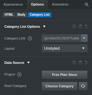
# Category List Options
- Category Link - if this option is provided, each category in the list will be wrapped in a link that points to this URL. The URL supports
{id}placeholders, which are replaced with the category ID (e.g./products.html?category={id}). - Layout - choose the layout of the category list. Currently categories can be displayed in a horizontal bar or an unstyled list (default).
# Data Source
- Store - click the button to choose/change the Reflow Store. This is a design wide setting, so it will be applied to all ecommerce components in your project.
- Category - with this option you can limit the list to only show a specific category and its subcategories.
- - click this button to fetch the newest data after you've made changes to a category in the list on Reflow's website.
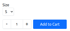
# Add to Cart
The Add to Cart component renders a button which lets users add a specific product to their shopping cart. It can be useful if you wish to build an entirely custom product page, while only making use of Bootstrap Studio's add to cart and checkout functionality.
# Available Options
You can configure the Add to Cart through the Options Panel. A number of customization options are available:
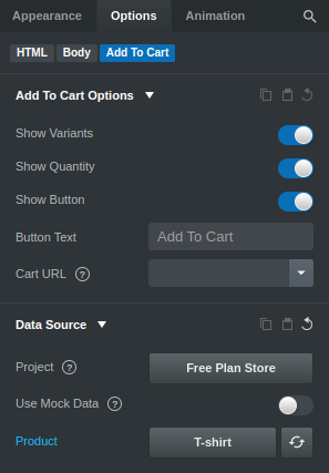
# Add to Cart Options
- Show XXX - toggle the variants dropdown, quantity widget, Add to Cart button.
- Button Text - change the "Add to Cart" text to something else.
- Cart URL - a URL to the page where your Shopping Cart is located. When Add to Cart is clicked, a Toast notification is shown to let users know that the product was successfully added to their cart. If you have set the Cart URL option, this notification includes a See Cart button that opens the Shopping Cart page.
# Data Source
- Store - click the button to choose/change the Reflow Store. This is a design wide setting, so it will be applied to all ecommerce components in your project.
- Use Mock Data - when this setting is switched on, Bootstrap Studio will use a mock product for the component. This is useful when testing how a variation dropdown would look like in your design. This setting is only applied in the app (you won't see the mock data in the Browser Preview or when exporting).
- Product - click this button to choose which product from your store the component should display.
- - click this button to fetch the newest data after you've made changes to the displayed product.
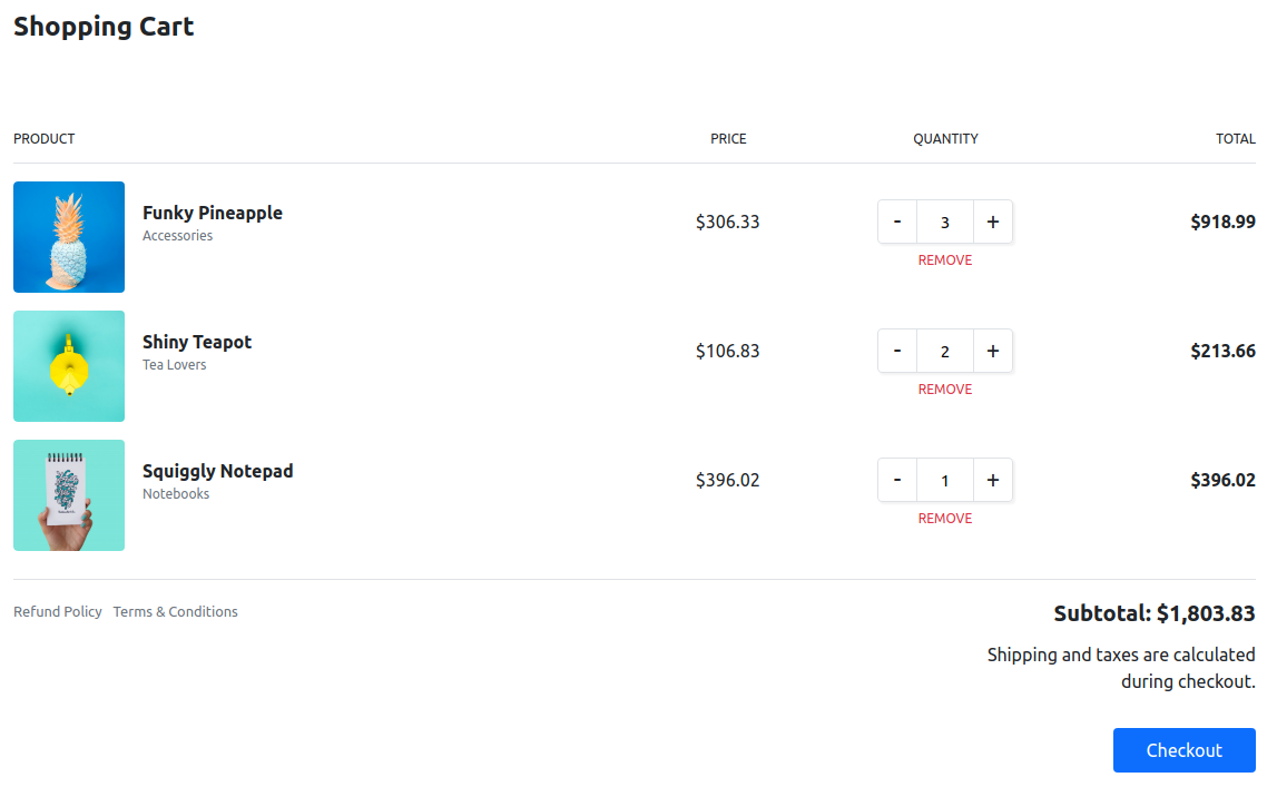
# Shopping Cart
The Shopping Cart component renders a fully functional shopping cart. It lets users change product quantities and remove products and finish their checkout. Payments are transferred to the linked PayPal/Stripe account and orders are recorded in Reflow's control panel.
# Available Options
You can configure the Shopping Cart through the Options Panel. A number of customization options are available:
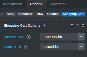
# Shopping Cart Options
- Success URL - the URL that customers will be redirected to after a successful purchase (defaults to the current page).
- Cancel URL - the URL that customers will be redirected to if they cancel the payment (defaults to the current page).
# Data Source
- Store - click the button to choose/change the Reflow Store. This is a design wide setting, so it will be applied to all ecommerce components in your project.
Note
When the Shopping Cart components is selected, you can use the Previous Step and Next Step buttons in the toolbar to preview the Checkout and Payment screens.
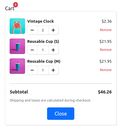
# View Cart
The View Cart component renders an element with a badge containing the number of products contained in the shopping cart. When clicked, it can display a dropdown/sidebar that lets users see a summary of their shopping cart on any page.
# Available Options
You can configure the View Cart through the Options Panel. A number of customization options are available:
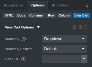
# View Cart Options
- Summary - choose how the shopping cart summary should be displayed - in a dropdown, sidebar or not at all.
- Summary Position - choose whether the summary should be aligned to the left or to the right.
- Cart URL - the URL of a page where a Shopping Cart components is located.
# Data Source
- Store - click the button to choose/change the Reflow Store. This is a design wide setting, so it will be applied to all ecommerce components in your project.
Note
You can replace the "Cart" text in the View Cart component with an icon or any content of your liking in order to customize the dropdown/sidebar toggle.
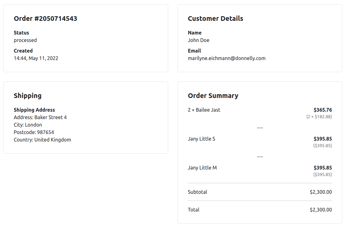
# Order Status
The Order Status component renders an order and all of its details, including shipping status, list of purchased products and more. This component is intended for building an order overview page on your website, which customers can visit at any time to track the status of their purchase.
# Available Options
You can configure the Order Status through the Options Panel. A number of customization options are available:
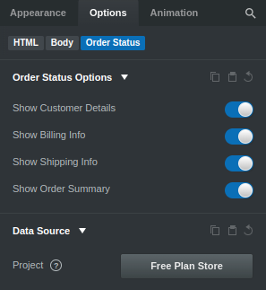
# Order Status Options
- Show XXX - toggle the order details, customer details, shipping info and order summary sections.
# Data Source
- Store - click the button to choose/change the Reflow Store. This is a design wide setting, so it will be applied to all ecommerce components in your project.
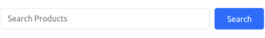
# Product Search
The Product Search component renders an input field for searching in a store's products. This component works in conjunction with Product List. Product Search presents a search field and redirects to a page on your site where a Product List is placed.
# Available Options
You can configure the Product Search through the Options Panel. A number of customization options are available:
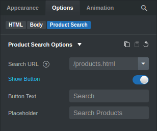
# Product Search Options
- Search URL - the URL or page where customers should be redirected to when they enter a search phrase.
- Show Button - toggle the search button.
- Button Text - customize the search button's text.
- Placeholder - customize the placeholder of the search input.
# Data Source
- Store - click the button to choose/change the Reflow Store. This is a design wide setting, so it will be applied to all ecommerce components in your project.
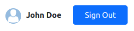
# Sign In Button v2
The Sign In Button component allows your customers to create a user account in your store and sign in and out. It takes advantage of Reflow's Store Registrations feature.
The component has two states depending on the customer status:
- Guest - Shown when the customer is not logged in. This state displays a button for signing in with an existing account or creating a new one.
- Authenticated - For logged in users, the
Sign In Buttoncomponent shows information about their customer profile and allows them to sign out.
# Available Options
You can configure the Sign In Button through the Options Panel. A number of customization options are available:
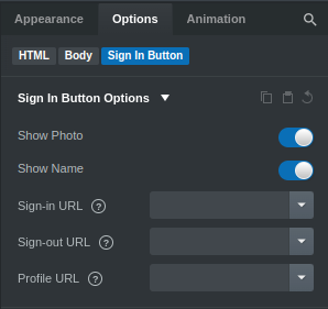
# Sign In Button Options
- Show XXX - toggle the user photo and name.
- Sign-in URL - the URL or page where customers should be redirected to after the sign in process is complete.
- Sign-out URL - the URL or page where customers should be redirected to after signing out.
- Profile URL - clicking on the auth button in its authenticated state will redirect to the supplied profile URL.
# Data Source
- Store - click the button to choose/change the Reflow Store. This is a design wide setting, so it will be applied to all ecommerce components in your project.
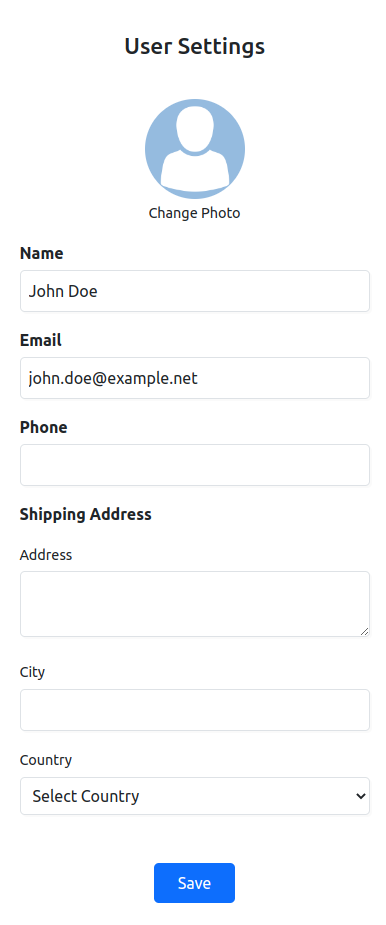
# User Settings v2
The User Settings component allows your registered customers to edit the content of their profile. It takes advantage of Reflow's Store Registrations feature.
The component has two states depending on the customer status:
- Guest - Shown when the customer is not logged in. This state displays a button for signing in with an existing account or creating a new one.
- Authenticated - For logged in users, the
User Settingscomponent shows a form with a number of inputs for changing the user's profile photo, name, email, shipping address and more.
# Available Options
You can configure the User Settings through the Options Panel. A number of customization options are available:
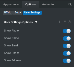
# User Settings Options
- Show XXX - toggle the user photo, name, email, phone and address.
# Data Source
- Store - click the button to choose/change the Reflow Store. This is a design wide setting, so it will be applied to all ecommerce components in your project.
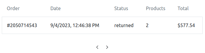
# User Orders v2
The User Orders component allows your registered customers to view their order history. It takes advantage of Reflow's Store Registrations feature.
The component has two states depending on the customer status:
- Guest - Shown when the customer is not logged in. This state displays a button for signing in with an existing account or creating a new one.
- Authenticated - For logged in users, the
User Orderscomponent shows a list of orders.
# Available Options
You can configure the User Orders through the Options Panel. A number of customization options are available:
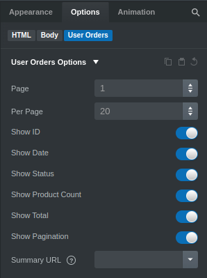
# User Orders Options
- Page - choose which page of results to show. If not set, displays the first page.
- Per Page - how many orders you wish to show per page. Defaults to 20.
- Summary URL - if set, this attribute wraps the orders table rows into links that point to the URL you've set. Each table row will append the respective order's
order_idandsecret_hash, so if there is an Order Status component on the page it will automatically load the selected order. - Show XXX - toggle the order ID, date, status, product count, total and pagination.
# Data Source
- Store - click the button to choose/change the Reflow Store. This is a design wide setting, so it will be applied to all ecommerce components in your project.