# Dark Mode
Bootstrap Studio makes it easy to build and preview websites with dark and light color modes. You can force your site to always be in light, dark or auto mode, and you can also let users switch modes themselves.
Note: Color modes are only supported in Bootstrap 5 and later. Bootstrap 3 and 4 have no built-in support for dark mode.
# Changing the Default
By default designs are in Light mode and ignore the operating system preference of the user. You can switch them to Dark or to Auto (adapt to the visitor's preferred color mode) from the Settings dialog.

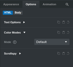
The Default Color Mode will be applied to all pages in your design. If you want to change the color mode of a specific page, you can select the HTML component and go to the Color Modes setting in the Options Panel (right sidebar).

TIP
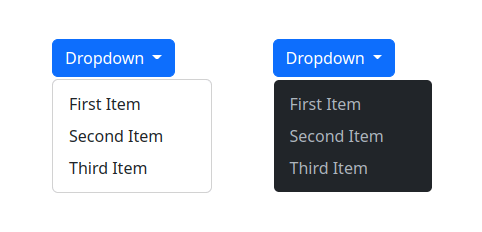
Many components (dropdowns, forms, etc) also have individualized dark mode settings in their Options. You can change their color mode and it will only affect the selected component and its children instead of the entire page.

# Customizing
You can modify the built-in Bootstrap variables for either Light or Dark mode from the Theme Panel on the bottom right. You can change the theme colors, font size/weight, borders and much more.

# Previewing
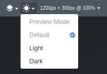
To preview the themes in the app, use the new Color Mode switcher in the toolbar, next to the zoom-in/out and canvas size icons.

Note that this affects only what you see in Bootstrap Studio, it doesn't change the color mode that's applied when exporting, previewing or publishing.
# Theme Switcher
The Theme Switcher component lets website visitors switch between Dark, Light and Auto modes on the fly. Just drag and drop it to the Navbar or somewhere else on the page and the app will automatically generate the necessary JS.
← Themes Custom Code →
